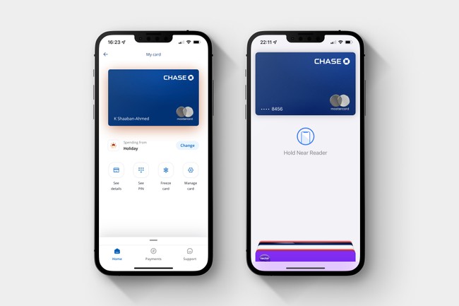
Chase UK - Account Onboarding Experience
— Design, App, Client — 2 min read
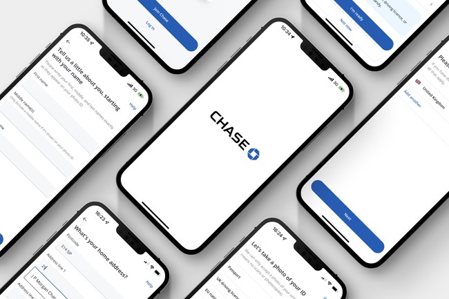
The Chase UK current account is a digital-only banking product. This meant that everything necessary to provide banking services to our customers must reside in the app. I helped the onboarding squad build an experience that allowed new customers to successfully onboard in less than 10 minutes, through an iterative design process.
Designing an inclusive experience
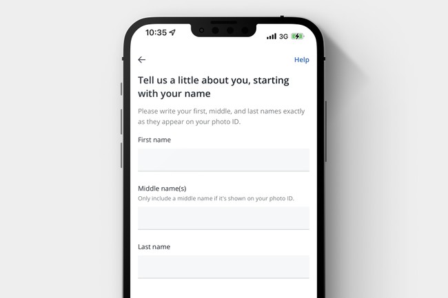
The initial list of required fields included the customer's title and gender. With a mission to make our app more inclusive, I investigated to understand the business reasons for gathering this information. I worked with legal, compliance and product stakeholders to build and present a case to remove requirements to obtain these fields.
One thing per page
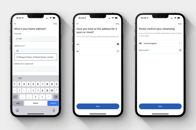
Through an iterative process and working with our UX writers, I perfected the UI to have simple and easy to understand questions. We used the "one thing per page/screen" principle to focus on the specific question and its answer. This means more steps to the onboarding flow, however customers move through the journey with less frustration. With a "one thing per page" approach, we can use analytics to identify usability pain points more quickly than having multiple questions on a single page.
Moments of delight
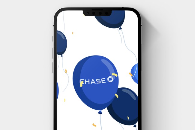
Through competitor analysis, I observed a significant variation between the process of applying for a bank account and receiving a decision. For a number of the incumbent banks, the application would be processed during working hours or require a customer to visit a branch to complete their application process. Since the Chase account didn't suffer from the same time-consuming approach, we wanted to celebrate our customer's successful application. Whenever a customer signs up successfully, we maximised our short decision process and designed a screen to mark the occasion with an animation of balloons. Our customers enjoy this inclusion, making it a highlight of the experience.
Ready to spend
Once a customer successfully onboards, we issue their physical card. During our initial research sessions, customers resigned to the fact that receiving a card by mail is a slow experience, often taking days or weeks to arrive. During this wait, customers would have little reason to open the app to explore their new accounts, resulting in a drop in app engagement. Drops in engagement frequently result in lower customer retention and jeopardise acquisition efforts. When issuing the physical card (by post), we securely store a set of virtual card details within the app. This allows customers to make card payments the moment their application is complete. I designed the end of the onboarding flow to encourage customers to connect their accounts to Apple Pay and Google Pay, so they are ready to spend and engage with the app.
